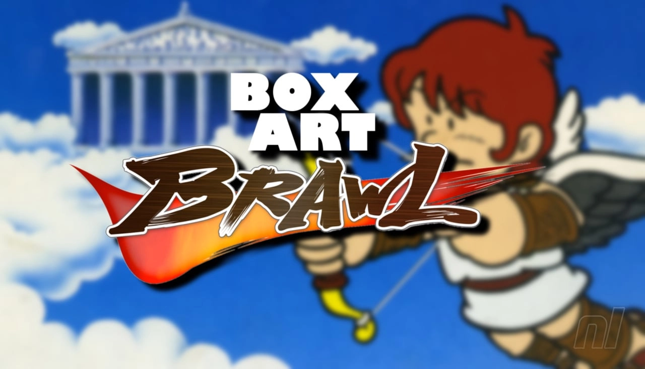
Welcome to the latest edition of Box Art Brawl, where passionate fans and gamers come together to scrutinize and vote on the box art designs of popular video games from different global regions. This week, we are diving into the timeless NES classic, Kid Icarus, which has garnered a loyal fanbase since its original release in the 1980s.
Before we delve into the striking differences between the box arts of North America, Europe, and Japan, let's revisit last week’s results. In the previous brawl, Balloon Fight's box art was put under the microscope. The pixel art-influenced black box from the US edition emerged victorious with 42% of the vote, while Japan and Europe trailed behind at 33% and 24%, respectively. This week's combatants have quite a few similarities in approach to last week's contender, making this brawl even more interesting.
Kid Icarus first graced the gaming world in 1986 in Japan and a year later reached Western gamers. The game's protagonist, the young angelic character named Pit, embarks on a quest that mixes action, adventure, and platformer elements. This game, with its mythology-inspired setting, was a technical achievement at the time and has continued to be a beloved title. It even spurred a modern sequel on the 3DS system, Kid Icarus: Uprising, which is considered a highlight of the handheld's library.
Let’s take a closer look at each region’s interpretation of Kid Icarus’s box art:
1. **North America**
The North American version opts for a familiar approach seen in many other NES games of the time. Although it doesn’t feature the typical ‘black box’ design, it carries a nostalgic pixel art style that showcases the main character, Pit, in sprite form. This serves not only as an artwork but also gives potential buyers a sneak peek at what they might expect from the gameplay.
2. **Europe**
Over in Europe, the box art takes a different creative direction. The design features Pit depicted in a more serene and tranquil pose, floating against a clear blue sky while aiming his bow. This rendition prioritizes a calmer, almost peaceful visualization of the game's protagonist, which contrasts distinctly from the action-oriented portrayal often seen in video games.
3. **Japan**
Finally, the Japanese version of Kid Icarus’s box art maintains a similarity with the European design, showcasing Pit in much the same pose. However, the changes are in the details: Pit is angled slightly differently and highlighted by an angelic yellow glow that adds a divine touch to the artwork. The background is lighter, and the elegant Japanese text that titles the game adds a distinctive and attractive flair.
Each version of the box art reflects different artistic sensibilities and marketing strategies aimed at appealing to the gaming audiences of their respective regions. The North American version focuses on action and gameplay, the European leans into aesthetics and tranquility, and the Japanese version mixes a bit of both with a unique stylistic twist.
The poll results reflect the diverse preferences of the gaming community. Japan leads with 57% of the votes, showing a strong favoritism towards the combination of simplicity, style, and cultural elegance. Europe follows with 29% support, perhaps as a nod to its unique tranquil portrayal of Pit. North America rounds out the poll with 14%, indicating a lesser enthusiasm for the more traditional gameplay-oriented cover art.
The interpretation of Kid Icarus's box art across different regions illustrates how cultural preferences and design philosophies can influence the presentation of video games globally. Each design, while showcasing the same game, tells a different story through its artwork and appeals to the varying tastes of gamers internationally. As we wrap up this edition of Box Art Brawl, make sure to cast your vote on next week’s featured game box art, continuing this fascinating exploration into the visual history of video games.


You must be logged in to post a comment!