
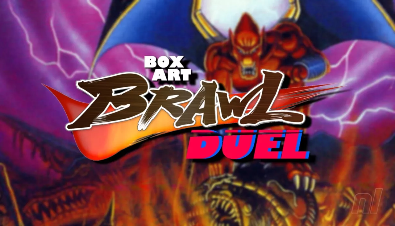
Welcome to another exciting edition of Box Art Brawl, where we pit different regional versions of video game box art against one another to see which design resonates more with fans. This time, we're focusing on the SNES game Demon’s Crest, released by Capcom in the mid-90s, a title that has garnered respect for its engaging side-scrolling gameplay and is also available on the Nintendo Switch Online service.
Previously, we analyzed the box art for Mario Paint, another SNES classic, where the colorful and whimsical Western design comfortably defeated the more minimalistic Japanese version with a whopping 89% of the votes. This strong preference showcased the appeal of vibrant and engaging artwork among voters.
Turning the spotlight back onto this week’s contender, Demon’s Crest brings us a face-off between the combined forces of North America and Europe against Japan. Given the similarities between the North American and European designs, they have been grouped together for this duel, making the battle a direct East vs. West showdown.
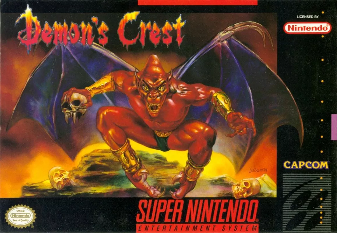
In the Western corner, the box art features the game's protagonist, Firebrand, in a dynamic pose, clutching a skull menacingly. This portrayal capitalizes on the game’s dark fantasy elements and does an excellent job representing the mood and tone of the game. The illustration aims for an immediate impact, leveraging the allure of its dark hero to attract fans of adventure and robust action-packed narratives.
Switching to the Eastern contender, the Japanese box art employs the portrait orientation typical of many Japanese SNES games, providing a different canvas to work with. This version also features Firebrand, positioned against what appears to be a gateway to a demonic realm. The Japanese design uses brighter colors and dramatic lighting, enhanced further by striking thunderbolts, adding to the visual impact of the box art. This more vivid portrayal captures the eye and invites potential players into its intensely mythical world.
The cultural differences in design philosophy are evident in the way each region chooses to represent the same game. Western designs often opt for bold, straightforward appeals to emotion and excitement, while Japanese artworks tend to incorporate intricate details and vibrant visuals that suggest a deeper narrative context.
The decision is now in your hands. Do you prefer the stark, impactful Western design that focuses solely on the protagonist in a classic hero pose? Or does the elaborate and brightly colored Japanese version that teases a broader story appeal more to your artistic sensibilities?
Remember, every vote counts as we look to crown this week's favorite box art. Cast your vote and make your opinion known in the ongoing battle of aesthetics and cultural expression in video game marketing. Don't forget to check back for the results and for more engaging comparisons in future editions of Box Art Brawl.


You must be logged in to post a comment!